Choosing the right font for your house numbers is more than an aesthetic decision—it's about balancing style, readability, and functionality. Clear, visible address numbers are essential for emergency services, delivery drivers, and guests, while the font helps express your home's personality and enhances curb appeal. At Dropcap Studio, we offer a curated selection of modern fonts designed specifically for house numbers, focusing on timeless designs that prioritize legibility and contemporary elegance.
Key Factors to Consider When Selecting a Font
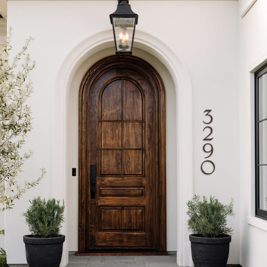
1. Prioritize Readability and Visibility
The most important aspect of any house number font is how easily it can be read from the street, especially at a distance or in low light. Sans-serif fonts—those without the small decorative strokes (serifs) at the ends of letters—are widely recommended for superior visibility. Their clean, straight lines make numbers stand out clearly, reducing confusion between similar digits like 3 and 8 or 1 and 7.
Avoid overly decorative, script, or thin fonts, as they can become hard to decipher quickly. Thick, bold strokes in sans-serif styles ensure maximum legibility for first responders and drivers.
2. Match Your Home's Architectural Style
Your font should complement your home's design:
- Modern or Contemporary Homes: Clean sans-serif fonts with geometric precision work best, creating a sleek, minimalist look.
- Mid-Century Modern: Fonts inspired by classic architects, featuring open forms and rounded elements, add authentic retro charm without sacrificing readability.
- Traditional or Classic Homes: While serif fonts can evoke elegance, opt for subtle versions if visibility is a priority, or blend with sans-serif for a updated feel.
3. Consider Size and Proportions
Larger numbers (6 inches or more) pair well with bold fonts to maintain proportions. Ensure the font's numerals are uniformly weighted and spaced for even alignment on your facade.
4. Think About Material and Finish Contrast
The font's style interacts with your chosen material (like brushed metal or matte finishes). High-contrast setups—dark numbers on light backgrounds or vice versa—enhance readability regardless of font.
Popular Font Styles for House Numbers
- Clean Sans-Serif: Timeless and highly legible, ideal for most modern homes. Simple, geometric designs ensure quick recognition.
- Geometric and Minimalist: Precise lines with subtle rounded edges for a sophisticated, contemporary vibe.
- Mid-Century Inspired: Open, airy numerals with balanced proportions, perfect for adding personality while staying functional.
These styles dominate current trends because they combine form and function seamlessly.
Make the Right Choice with Dropcap Studio
Selecting the perfect font elevates your home's exterior from ordinary to standout. At Dropcap Studio, our house numbers feature premium modern fonts crafted for durability, weather resistance, and exceptional visibility. We focus on designs that look stunning during the day and remain clear when it matters most.
Discover our collection and find the ideal font to suit your style at dropcapstudio.com. Upgrade your address today—it's a small change with a big impact on safety, convenience, and curb appeal!
Share:
Top 10 Modern House Number Trends for 2026
Budget-Friendly Ways to Update Your Curb Appeal This Winter